Reimagining the MyGate Resident App for millions of users
From visitor management to a complete resident super-app.
MyGate started as a visitor management app for gated communities. But as new features like community communication, home services, and payments were added, the existing information architecture made discovery increasingly difficult-hurting both user experience and business growth.
The objective was to address a core structural problem: the app had grown faster than its navigation. Features were hard to find, the hierarchy felt arbitrary, and users were missing capabilities that could meaningfully improve their daily lives.
Understanding how 1M+ residents actually use MyGate.
The research activity was planned with the following objectives:
An initial survey was sent to 1 lakh users selected randomly across the country and 350 of them volunteered to participate further. 18 interviews were conducted distributed across segments to ensure fair representation.
Analysis of quarterly NPS survey results highlighted recurring themes and pain points. App usage data from Clevertap and Metabase helped in understanding user behaviour patterns.
Three user types, one clear direction.
Irrespective of age, living situation and phone usage habits, users fell into 3 major categories based on attitude and motivation. This helped us understand user expectations around how the app should help them with society and household activities.
The major themes in user needs identified during research were:
What the current app was getting wrong.
Recurring concerns emerged across all user interviews-the information architecture felt fragmented, features were buried, and the interface didn't reflect how residents actually thought about their daily tasks.
- Discoverability of new features was low
- Quick Actions had become a blindspot for several users
- Critical actions changed position in the UI frequently
- User tasks, communication and promotional content displayed together without clear segregation
- Primarily used for accessing daily help profile only
- Use cases for a visit log was rare
- Finding a specific visitor from the activity feed was difficult
- Users did not know what features are available in this page
- Several features were force-fitted with no obvious placement in the app
- Mostly a one-time setup page with little ongoing utility
- Most items are more aligned to profile and settings
Redefining the information architecture from the ground up.
Before getting on to defining the new information architecture, few considerations and guiding directions were set based on the insights generated from the research activities.
By mapping out the MyGate ecosystem, features were bucketed into 4 major categories based on the physical environment. As a user belongs to a home, home to a community and community to a locality. So all the existing and planned features were placed into these 4 categories. A card sorting experiment and tree testing was done with few users who were onboarded during the user interviews for further engagement. The users faced difficulties in the segregation between home and society. There were overlapping features such as payments and Helpdesk. So features belonging to home and engagement was rearranged into:
Exploring structure before visuals.
"When an app grows faster than its navigation, users don't explore-they abandon. Information architecture isn't a detail, it's the product."
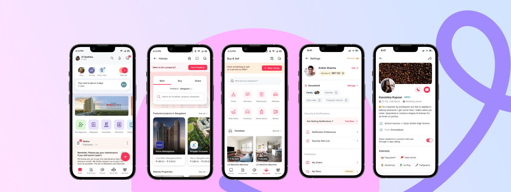
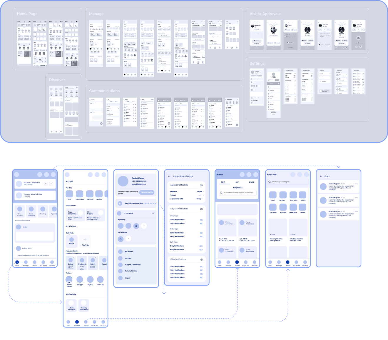
The redesigned app, built for millions.
Most users land on this screen after visitor approval notification. This page is structured to build further engagement within the app and to make sure that frequent actions are accessible upfront.
Finding residents and communicating directly with them when needed was highlighted across several interviews and NPS surveys. Chat and calls was added as a new capability which could be accessed from the page headers directly.
Homes and Buy & Sell were introduced as MVPs during the redesign activity. These 2 features were organically generating engagement, primarily due to the trust factor as both the seller and buyer are verified residents of the society. So these features were redesigned and made accessible directly from the bottom navigation.
The existing settings page was getting cluttered as more and more items got introduced over time. This page was redesigned to highlight some of the important actions that users often ended up searching for. The profile was also redesigned to drive discovery and spark conversations among residents living in the same community.
Results that validated the redesign.
"Designing for scale means designing for the edges — the power user who wants control, the passive user who just wants to know their visitor arrived. A great IA serves both without asking them to choose."